Of everything to come out of YouTube, my favourite thing is unquestionably science communication channel Kurzgesagt.
Kurzgesagt came into my life in 2014, around the time I was a Physics undergraduate. I have vivid memories of sitting in dimly lit, underground libraries craned over the desk - not to study my textbook, but the colourful ducks bouncing around the screen. Even the best books are going to struggle competing for my attention against those guys - apologies, Quantum Field Theory for the Gifted Amateur.
I found myself idly browsing their website recently when I was taken by this page and, specifically, its hero image:

Now, it’s entirely standard fare that illustrations from this org should carry that uniquely delightful combination of precise and cartoonish - but this was different still. It felt alive. How often do web pages have that effect on someone?
Notice how the blurred background drifts slowly behind as you scroll, giving a sense of an ocean expanse. How colour choice makes the yellows seem to glow even more.
Inevitably, the developer in me piped up: “I wonder how they built that…”
A dive through the developer console
Reverse-engineering web pages is made mercifully easy thanks to our friend, the browser developer tools. Provided the source is not obfuscated, we can readily inspect how the Kurzgesagt labs cooked up their landing page.
Skipping past the <head>, there’s something immediately interesting at the start of the <body> tag:
<body class="overflow-x-hidden">
  <!-- omitted for brevity's sake... -->
  <link
    rel="preload"
    as="image"
    href="/_next/static/media/background-bacteria.04664857.svg"
  /><link
    rel="preload"
    as="image"
    href="/_next/static/media/sunlight.9a61d705.svg"
  /><link
    rel="preload"
    as="image"
    href="/_next/static/media/bacteria2.3dc76cea.svg"
  />
</body>
A series of preloaded images which, if followed, return some piece of the hero image’s background (e.g. the background bacteria).

This is interesting, as it contrasts with how the foreground of the hero is built - check out this HTML:
<div
  class="absolute left-[min(72.916vw,65.62rem)] top-[min(36.111vw,32.5rem)] mobile:left-[75.641vw] mobile:top-[4.615vw]"
>
  <svg
    width="min(19.791vw, 17.813rem)"
    viewBox="0 0 286 178"
    fill="none"
    xmlns="http://www.w3.org/2000/svg"
    aria-hidden="true"
  >
    <path
      d="M148.164 120.182C151.153 120.182 153.576 117.759 153.576 114.77C153.576 111.78 151.153 109.357 148.164 109.357C145.174 109.357 142.751 111.78 142.751 114.77C142.751 117.759 145.174 120.182 148.164 120.182Z"
      fill="#005B94"
    ></path>
    <!-- Again, omitted for brevity... -->
  </svg>
</div>
where you can see that the individual SVG <path> elements are inlined within the DOM of the page itself. So the team at Kurzgesagt is mixing up different techniques for displaying SVGs - why might they do that?
I’d speculate two reasons:
- Mobile layouts: The foreground’s
widthattribute means it is responsively styled, so that all its elements can be positioned relative to the title, depending on the viewport size. - Performance: The inline SVG travels inside the HTML, so it can’t be cached between visits. The large, blurry background is cheaper as separate files the browser can cache and draw just once.
Hold up: what is an SVG, anyway?
There are some fabulously concise explanations available elsewhere, which I’ll refer to rather than rehashing the same ideas with less elegance. TL;DR: SVGs provide another way to render content into the browser (alongside standard <div>s and canvases) - it’s how many Javascript chart libraries are built.
The fun thing about SVGs (and digital illustration, more generally) is the ease with which you can layer shapes on top of one another. Pulling up another Kurzgesagt image, we can see this exact process in reverse as we start to delete parts of the SVG:
Now, for the magic trick!
The same idea applies at the page level: the hero is split into a background layer and a foreground layer and, because each is its own element, they can be styled independently with CSS.
The specific property of interest to us is perspective. Its effect is to position the viewer at some “distance” from the screen. In doing so, it allows for elements positoned “closer” to us to appear larger and those further away to appear smaller. Becuase the perspective is set on the scrolling container itself, the “viewer” stays put while the content slides past - just as you stay put on a train while the landscape moves.
And this is how Kurzgesagt’s page achieves its magical sense of depth! The background SVG <img>s and the foreground inline <svg>s sit at different depths along the z-axis (notice the translateZ inline style):
<!-- 1. The scroll container: the whole page scrolls inside this, not <body> -->
<div style="position:absolute; top:0; bottom:0; left:0; right:0;
            overflow-y:auto; overflow-x:hidden;
            perspective:10px; perspective-origin:0% 0%;
            overscroll-behavior:none">

  <!-- 2. The hero wrapper keeps its children in 3D space, rather than flattening them -->
  <div class="relative flex h-header ..." style="transform-style:preserve-3d; z-index:-1">

    <!-- 3. The background layer, pushed back and scaled up -->
    <div class="absolute top-navigation h-header w-screen overflow-hidden ..."
         style="transform:translateZ(-10px) scale(2); transform-origin:0% 0%">
      <img src=".../sponsors_background.e836e5be.svg" />
      <img src=".../background-bacteria.04664857.svg" />
      <!-- ...the other background <img>s -->
    </div>

    <!-- Foreground: no transform, so it sits at z = 0 -->
    <div class="absolute top-0 z-10 ...">
      <h1>Let's create together!</h1>
      ...
      <svg viewBox="0 0 286 178">...inline paths...</svg>
    </div>
  </div>
</div>
Pretty neat? Well, let’s see what we can do if we take this for a spin ourselves:
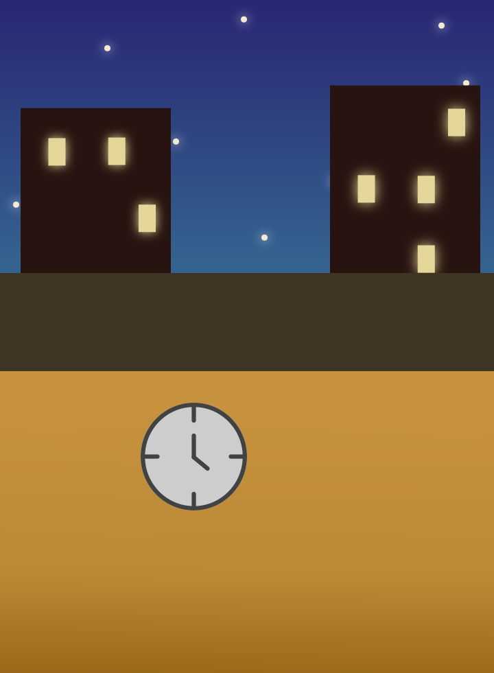
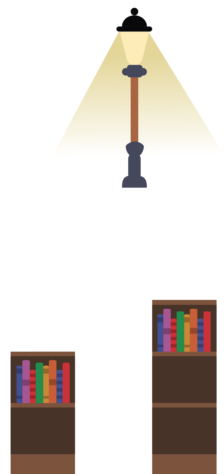
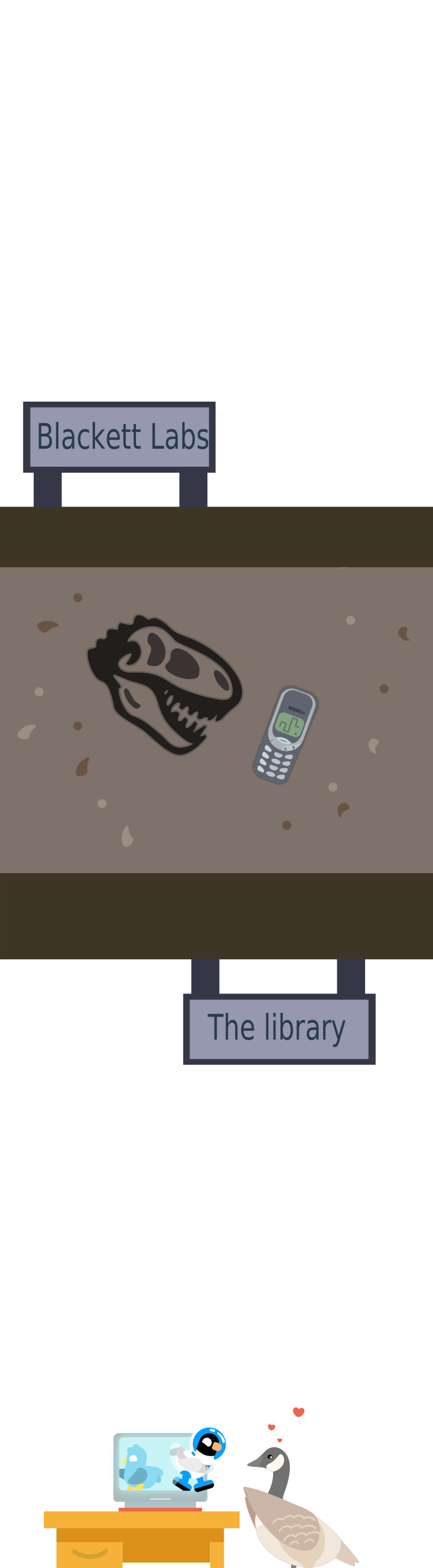
Not a masterpiece in composition, but you get the gist!